Behind the scenes – Creating a new Metro Studio logo with Rayola Creative

A new look for The Metro Studio logo
After 15 or so years, we decided it was time to update the logo for The Metro Studio, and wanted to work it into our fundraising campaign this fall for ‘The Next Phase.’ Our go to designer, Rayola Creative, was up for this task. We asked Clint Hutzulak at Rayola to share a bit about his process of working on a new logo for The Metro Studio. Read more about the logo development, design & inspiration from Clint.
In late 2020, Intrepid Theatre asked me to rebrand the Metro Studio, as the first step in a capital campaign to raise funds for modernizing the theatre. Sean Guist, marketing director, asked for a logo with some kind of movement, a visual that could convey the idea that the Metro is a space for more than just theatrical events, that it is an inclusive hub for Victoria’s performing arts community.
My goal was to design something simple enough that it could be used for a neon sign, and something versatile enough to be used everywhere from site signage to a web favicon or app icon. It should be the cornerstone of a robust new branding system, with flexibility to grow and adapt whether as pixels, paper or physical products.
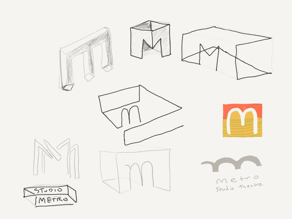
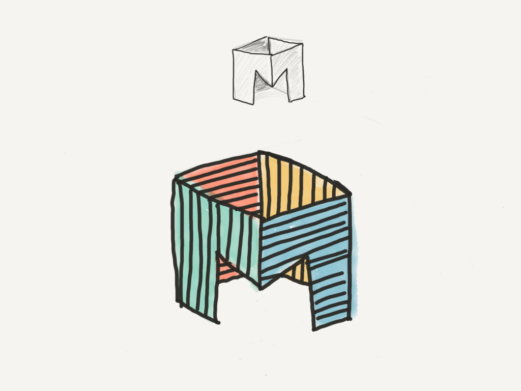
I sketched about 20 different icons on my iPad. The most interesting ones featured a three-dimensional drawing of a capital letter M to represent the Metro as a physical space (I thought of it as the M-box). After the Intrepid team selected a sketch, I drew the icon in vector format, added type for the wordmark, and developed a polished version of the full logo for approval. I felt it still needed more refinement, so I sent my artwork to illustrator Kevin House and he tightened up the icon and added the magic that was missing.
In the final artwork, the boxy 3D M represents the physical Metro Studio building. The radiating lines demarcate the back walls of the box while at the same time indicating energy and movement; they also reference tiers of seating like we see in the amphitheatres of antiquity. The opening in the front of the M-box invites the viewer to enter into an imaginary space, where inside and out are simultaneously visible, where the inside can be bigger than the outside. It seems like a good metaphor for a theatre where just about anything can happen.
A few sketches from the logo development.


